If nursing staff need to report on the numbers of types of office visits or dispoistion of office visits, the Office Visit Charts can provide the required data.
To get there:
- From the PowerSchool start page, click Extended Reports under the Functions heading on the left side.
- Click the Health tab.
- Click on Office Visits Charts under the Office Visits heading.
The Office Visit Charts will provide 2 to 4 break downs of the office visit data based on a specific date range provided by the nursing staff.
Running the report:
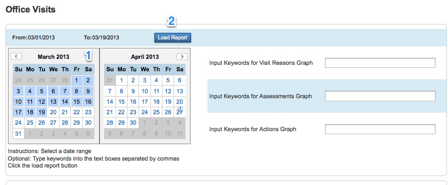
- Use the calendar, to select a date range.
- Click the arrows next to the months to change the months if necessary.
- Click on the start or end date of the date range.
- Then click on a second date. All dates between those dates will highlight in blue. The dates will also display in the From and To headings in the upper-left.
- Click the Load Report button.

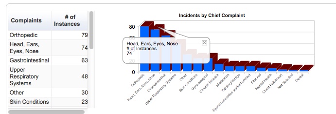
- Two charts will display after Load Report has been clicked: Chief Complaint and Disposition.
- The charts are ordered by most common to least common and the numbers are also displayed in a table to the left of each chart.
- Many of the headings are very long. To see the heading and number for any of the bars in a larger pop-out balloon, simply click on that bar.
Keyword Charts:
In addition to the chief complaint and disposition, charts can be generated based on the reason description and actions. The big difference is that these two fields are large text fields in the office visit; not drop-downs with a predefined set of possible values. In order to run charts on the text found in the reason description or actions, the nursing staff must provide a list of values to see on the charts (the keywords).
To run the charts with keyword searchs on reason description or actions take the following steps:
- Select a date range from the calendar.
- In the upper-right of the page are the titles Input Keywords for Visit Reasons Graph and Input Keywords for Actions Graph.
- Type into these text-boxes a list of keywords to display in the charts.
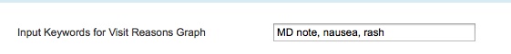
- Each keyword must be separate by a comma.
- Click the Load Report button.
- Underneath the regular Chief Complaint and Disposition charts will be the keyword charts.
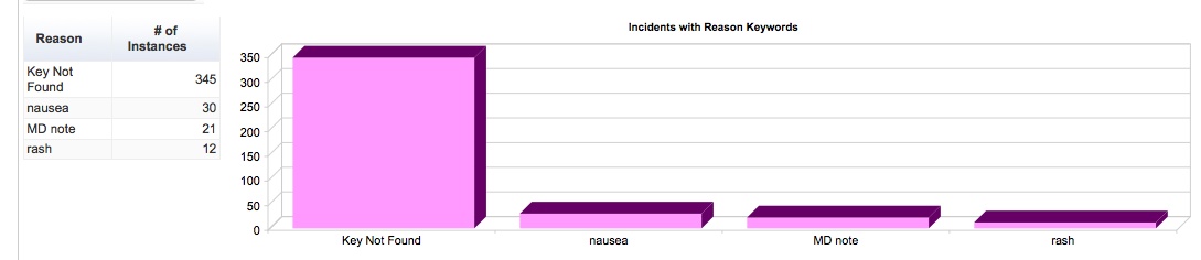
In the example below, the person running the report supplied the list “MD note, nausea, rash”. The charts searched the Reason Description text field from all the visits and found:
- 30 of the office visits had the word “nausea” in the Reason Description text field.
- 21 of the office visits had the word “MD note” in the Reason Description text field.
- 12 of the office visits had the word “rash” in the Reason Description text field.
- 345 of the office visits did not have any of the keywords that were provided.